

大阪学院高校サイン計画
Signage planning for Osaka Gakuin University Senior High School
PEOPLE
SUZUKI Tezzo (Graphic Designer), Atsushi Kitagawara Architects (Architect)
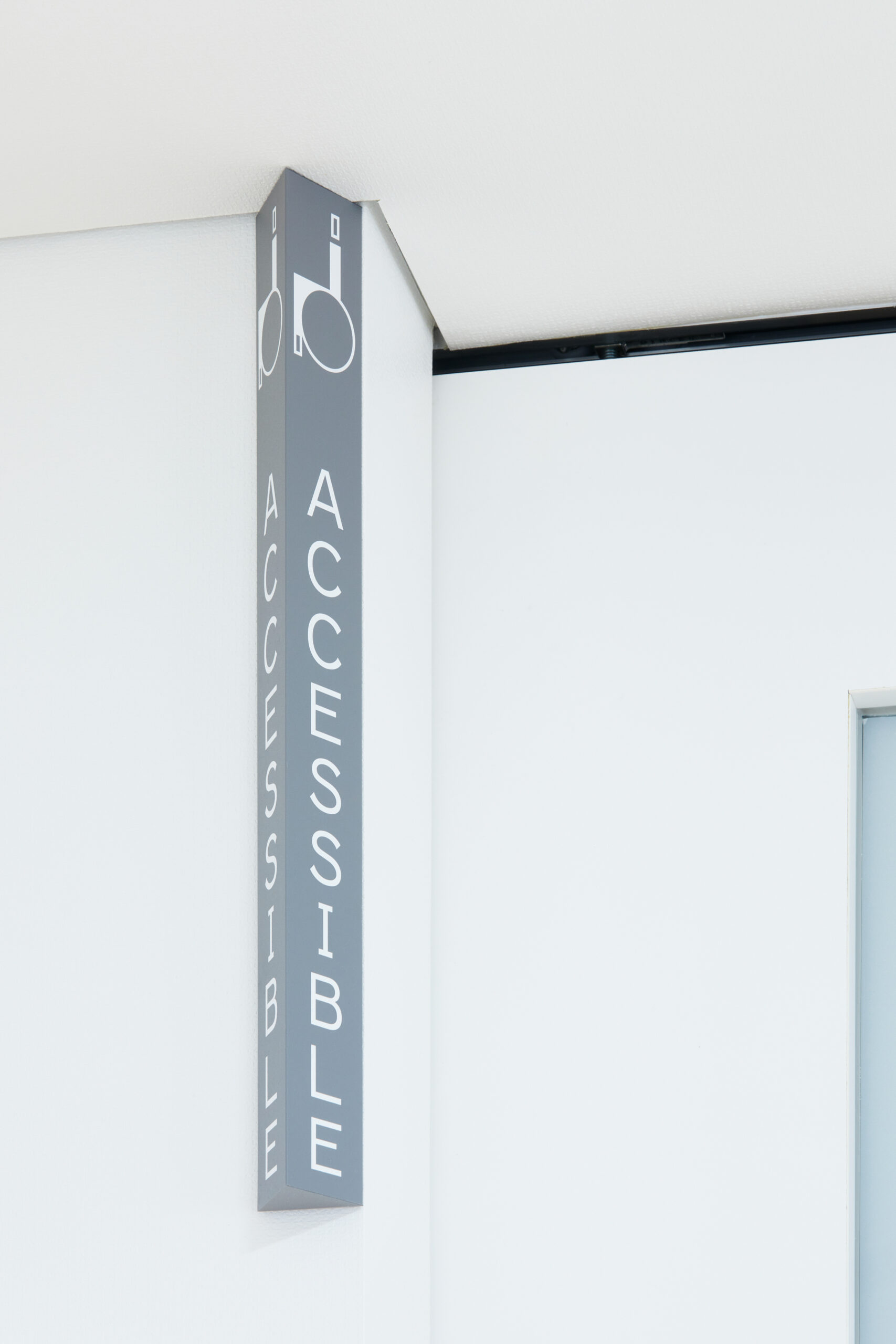
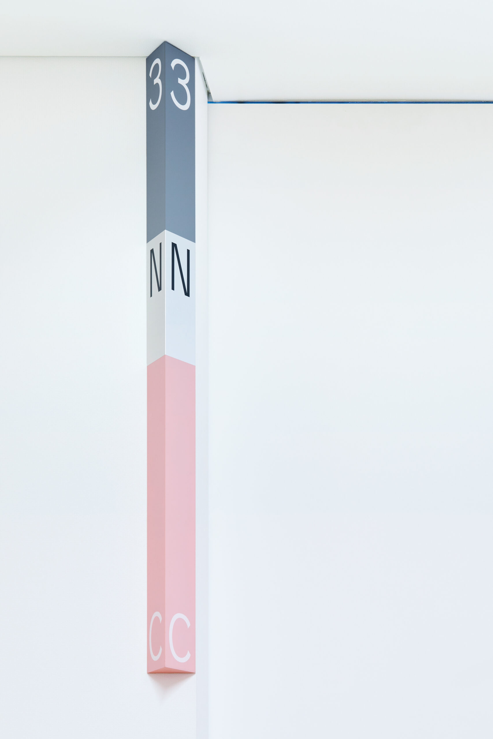
私立高校新校舎のサイン計画。グラフィックデザイナー・鈴木哲生との協働。建築設計は北川原温建築都市研究所。多角形が使われる建築の造形に呼応した三角柱の外形。 2,3階、南北の廊下が酷似した建築のため、XYZ軸の座標に対応した色や質感の掛け合わせで現在地を直感的に把握できる計画。 Venusをベースに作った欧文縦組み用オリジナル書体は6種のハイト違いがある。東京TDC賞2021 ノミネート作品。
Signage design for a new school building for a private high school. In collaboration with Tezzo Suzuki, a graphic designer. The architectural design was by Atsushi Kitagawara Architects Inc. The outer shape of the triangular columns corresponds to the architectural form that uses polygonal shapes. Since the north-south corridor on the second and third floors are extremely similar, the plan allows visitors to intuitively grasp their current location by pairing colours and textures corresponding to the coordinates of the XYZ axis. The original typeface made for vertically positioning Western typefaces is based on Venus, and has six different heights. Nominated for the Tokyo TDC Annual Awards 2021.